Politics in Warren Ellis’s Desolation Jones
Posted: May 1, 2024 Filed under: review | Tags: British, comics, Desolation Jones, Labour Day, politics, secret service, US, Warren Ellis, Wildstorm Leave a commentIn mid-2005, i.e. between Iron Man: Extremis and Freakangels, Warren Ellis launched Desolation Jones together with artist J.H. Williams III (colours by José Villarrubia). Originally planned as an ongoing series, it was effectively cancelled after issue #8; this blogpost refers to the trade paperback Desolation Jones: Made in England which collects #1-6. In theory, the pairing of Ellis and Williams looks like a foolproof path to a massive success, but sadly, neither of them delivers their best work with this comic.
Anyway, that’s not the point here. The question is: does Desolation Jones add something to our understanding of Ellis as a political comics writer? At first glance, it’s not an overtly political story, but rather a superhero / detective kind of comic. The eponymous protagonist is the result of a medical experiment which, not unlike Captain America’s super soldier serum, has given him almost supernatural physical capabilities which make him near invincible in hand-to-hand combat. In contrast to Captain America, though, Jones suffers from side effects such as gray skin that is sensitive to sunlight, and occasional hallucinations that haunt him. He is hired by a collector of pornographic films who wants Jones to retrieve a stolen item from his collection, an assignment which takes Jones behind the scenes of the porn industry of Los Angeles.

The thing is, Jones is a former agent of the British Secret Service, and it was his former employer who subjected him to the cruel experiment, and afterwards discharged and confined him to Los Angeles – “Spook City” – which secretly serves as an open-air prison to former British and American secret agents like him. Now this element of the story does, of course, turn Desolation Jones into a political comic of sorts. In real life, intelligence agencies like the MI6, CIA, and NSA (all of which feature in this comic) are by themselves politically controversial because, unlike other governmental institutions, they operate in secret, which makes them difficult to control democratically, and because they operate above the law, e.g. by surveilling the citizens of their own country in ways that would be illegal even for the police.
Ellis seizes the opportunity to shed a bad light on secret services several times in the comic by having his characters tell of their experiences at work. In his former job, Jones “was taught to torture and kill some motherfucker until they tell me what I want to know”, and once he “had to snap the neck of a ten-year-old girl” with his bare hands. His business partner, a demolitions specialist, was asked to find a way to “acupuncture a small town to death with explosives” while working for the CIA. His antagonists, former US Army Intelligence, did “a lot of the same things as CIA Hostile Operations – destabilizing, training rebel troops, kidnap and interrogation.” (There is another intelligence atrocity of some importance to the plot revealed later in the comic, which I won’t spoil here.)
For Jones, his new job as a private investigator in Los Angeles is a kind of revenge, or redemption. He only takes jobs “within the community” of ex-intelligence agents, “because intel eats people up and spits them out. Because no one else should end up like me.” However, we never get to see the individuals orchestrating the intelligence operations, and we never learn why they do what they do. In another scene at the end of the book, Jones reiterates and continues the above quote: “I can’t stand seeing what was done to me being done to other people. Intel just chewing people up for no reason than that it finds chewing people up interesting.”

This senseless viciousness of government institutions marks Desolation Jones as an example of a recurring trope in Ellis’s comics, the ‘evil government’ (as opposed to his other political pet motifs, ‘weak government’ and ‘evil corporation’). Jones – the identification figure for the reader – is the unlikely hero who stands up against the powers that be. He may have lost the ability to feel pain, and he repeatedly claims he doesn’t care anymore whether anyone lives or dies, but he still has a conscience. At the end of the comic, when he learns about the crimes of his employer, he, in spite of his assignment, brings him to justice by killing him, and then tries to publicly expose his misdoings. We don’t learn whether Jones succeeds or not, but it is implied that everything Jones did was unwittingly part of the plan of someone presumably more powerful pulling the strings in secret. This time, it looks like even the superpowered individual is unable to bring about justice and salvage a failed democracy.
Katharina Swoboda’s framed animals – in comics?
Posted: March 31, 2024 Filed under: review | Tags: animals, architecture, comics, film, framing, Katharina Swoboda, theory, Women's History Month, zoos 1 CommentIn 2020, the same year when my article, “Formal Characteristics of Animal Liberation in Comics”, appeared in Closure, Katharina Swoboda completed her PhD thesis at HFBK Hamburg; it was published as a book last year under the title Gerahmte Tiere. Zoobauten als Sujets in Film und Video (“Framed animals. Zoo buildings as subjects in film and video”). This coincidental simultaneity is a bit unfortunate, given the similar subject matter of the two texts, as at least I would have benefitted from reading Swoboda’s book earlier, when working on my article. There seems to be no English edition of Gerahmte Tiere, but there is an English essay by Swoboda from 2022 (“Zoological Architecture and Empty Frames”) which looks like a condensed version of the book. In this blogpost I’ll refer to the German book though.
The first half of Gerahmte Tiere offers a thorough yet succinct (the whole book is just over 100 pages long) discussion of the theoretical literature relevant to the topic of zoo architecture on film, and develops a suitable theoretical framework (no pun intended). Swoboda’s main angle is that of a double framing: “Creating an image with a camera means to set a frame. Architecture frames animals – what happens when these architectural frames are superimposed with another frame, the filmic framing?” (p. 7; all translations mine).
There is a lot at stake in this framing, Swoboda claims: “Visual frames act as tools for the evaluation of what they contain. The way in which animals are presented in human culture has an effect on how they are treated sociopolitically. Zoos create and convey value concepts of animals, and zoo architecture, though mostly in the background of the field of vision, takes part in the construction of these concepts.” (p. 7). Thus, her central question is: “How are zoo buildings depicted in their role as display case, stage and prison in artistic video and film works?” (p. 8).
Even prior to being framed on film, though, animals are being subjected to a rather peculiar kind of framing in zoos: “In the zoo we find ways of staging that show animals from a specific point of view: the zoo structure represents a clear […] separation between human and animal. […] Biopolitically thinking, what is confined in the enclosure is perceived as ‘nature’, and what is outside of these frames – e.g. the visitor paths – belongs to the cultural, human domain. According to philosopher Brian Massumi [who in turn refers to Giorgio Agamben], the presentational design in the zoo subordinates the natural life (zoe) to the human life (bios). In this sense, zoo architecture forms a material barrier for the social value scale of living things. Animals in the enclosure are reduced to zoe, while human spectators remain in the frame of bios.” (p. 9-10).
Ultimately, both film and zoos are restricted to this presentational configuration: “According to Randy Malamud, […] every animal representation reduces animals to cultural allegories without reference to the real living being. […] Malamud separates animal representation from the actual (literal) animals: for him there is a cultural and a natural frame, without any overlap. As soon as animals are positioned within a cultural frame, they fall out of the natural frame. […] After Malamud, there is no ‘real’ animal inside the enclosure, but rather a ‘token’.” And according to John Berger, “In modern times, animals are gone from daily life, but all the more ubiquitous as symbols in culture. […] ‘Everywhere animals disappear. In zoos they constitute the living monument to their own disappearance.'” (p. 38-39).
This leads Swoboda to conclude that “[…] the sight of animals is limiting – no matter with which backdrops, information plates and educational services it is enriched. This gaze tells something about humans and their concepts of nature, but not about the animals.” (p. 43). Radically, her “ideal state of zoo architecture [would be] empty and no animals. For towards hollowing out is how zoos should develop in my opinion.” (p. 79).
All is not doom and gloom, however. In the examples that Swoboda discusses in the second half of the book, alternative, emancipatory takes are presented. For instance, László Moholy-Nagy’s documentary short film The New Architecture and the London Zoo (1936) “does its heterogeneous subjects justice and shows animals as living, feeling beings [….]. Anthropocentric and yet emancipating perspectives are those that establish animals as filmic figures. A single penguin, close up and shown from below, becomes a figure with agency. This perspective suggests that animals are also able to look at humans.” (p. 73).
A different device is used in another of the works analysed by Swoboda, Denis Côté’s documentary film Bestiaire (2012): “In Bestiaire it becomes obvious that this outside, the filmic off or hors-champ is part of the film and of reality. The world spreads outside of the image, and the animal goes where the spectators cannot follow. The static camera reduces the possible perspective for the audience, whose imagination constantly reaches out beyond the field of view.” This kind of pictorial concept “opens interstices that Laura McMahon identifies as non-anthropocentric markers in the film” (p. 93-94).
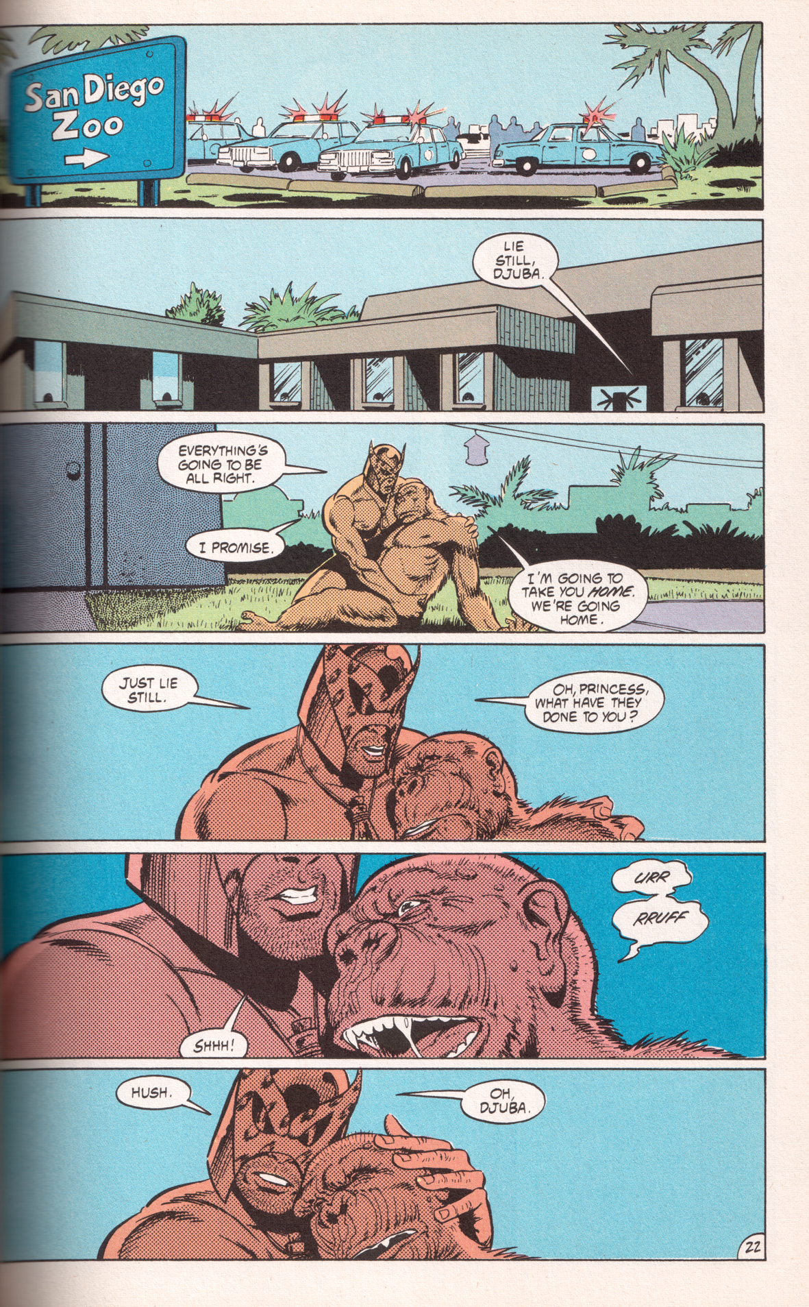
Two of the four comics I analyse in my aforementioned article are also set in zoos, at least partially. In Animal Man #3 by Grant Morrison and Chas Truog (1988), the ape Djuba is rescued from the laboratories in which she has been infected with a deadly virus, and taken to the San Diego Zoo where she dies. While not put in an enclosure there, she is basically taken from one animal prison to another. However, on the page with her final scene, the zoo architecture (which on the second panel still has a forbidding outlook, reminiscent of prison walls) disappears from the panel backgrounds entirely, her confinement thus rendered invisible, which is in line with the reading of Djuba’s death as her ‘ultimate freedom’.
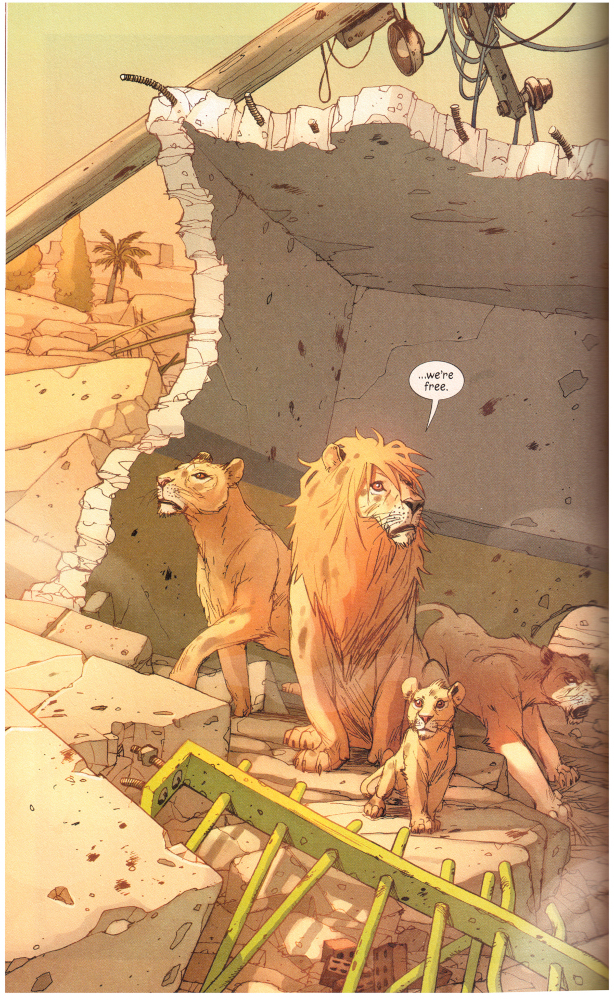
The zoo setting plays a larger role in the other comic, Pride of Baghdad by Brian K. Vaughan and Niko Henrichon (2011). Here, the zoo architecture is more obtrusive, with cage bars superimposed on the lion figures to emphasise their captivity in almost every panel – until their accidental liberation, when an explosion destroys the zoo buildings. Both Animal Man and Pride of Baghdad anthropomorphise their animal characters, try to instil empathy in the readers, and criticise the treatment of animals in human society. At the same time, of course, the usually rectangular panels of comics evoke the concepts of the frame and framing just as strongly as the camera-recorded image and the movie screen. In the end, the emancipatory potential of comics is limited by their mode of framing the animals, which is just as anthropocentric as that of film.
Index to all ‘theory’ posts on this weblog
Review, Jirō Taniguchi memorial edition: The Summit of the Gods
Posted: February 25, 2024 Filed under: review | Tags: action, Baku Yumemakura, climbing, comics, Jirō Taniguchi, Kamigami no itadaki, manga, sports Leave a commentWhen Jirō Taniguchi passed away seven years ago this month, he left behind two major mountain climbing manga (in addition to several others in which this topic plays some role): K (reviewed last year), and The Summit of the Gods.
Kami no itadaki (神々の山嶺; German title: Gipfel der Götter)
Language: German (originally Japanese)
Authors: Baku Yumemakura (writer), Jirō Taniguchi (artist)
Publisher: Schreiber & Leser (originally Shūeisha)
Year: 1st German edition 2007, this 4th edition 2022 (originally serialised 2000–2003)
Number of volumes: 5
Volumes reviewed: 1
Pages: ~310
Price: € 17
Website: https://www.mangaupdates.com/series/bpz5zru/kamigami-no-itadaki
ISBN: 978-3-937102-71-9
In the 1990s in a junk shop in Kathmandu, Japanese photographer Fukamachi comes across an old camera that might have been used by George Mallory on his Mount Everest expedition in 1924. Fukamachi returns to Japan and tries to find out more about the man who seems to have found the camera in the mountains: Habu, a legendary but elusive extreme mountaineer, also from Japan but now apparently living in Nepal. Fukamachi tracks down Habu’s former mountaineering club mates, and through those conversations, the manga pieces together Habu’s life story as a succession of flashbacks.
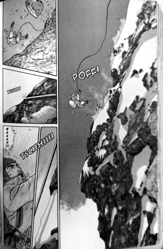
It is tempting to see Fukamachi’s storyline with the old camera as merely a framing narrative. At any rate, it is far less interesting than Habu’s story, which doesn’t start before page 120. Apparently, however, Fukamachi and Habu meet again in a later volume and their storylines are merged, which makes Fukamachi’s story indispensable. When only considering the first volume, though, its last two thirds which focus on Habu are the real deal. Habu is a fascinating character (unlike bland Fukamachi), obsessed with mountain climbing to the point of total disregard for anything and anyone else. We see how he joins the mountaineering club as a teenager in 1960, then tackles the most difficult and dangerous ascents in Japan, alienates his club mates, sees his team mate die at the other end of his rope, and so on.
There are lots of exciting climbing action scenes in the ‘Habu’ parts, and lots of not-so-exciting talking heads in the ‘Fukamachi’ parts. But no matter what is shown, often it is accompanied by caption boxes. There really is an overabundance of captions in this manga, and they feel even more obtrusive than in K. They don’t even represent the speech of Fukamachi’s interview partners: it’s a third-person narrator, usually telling us what we already can see in the pictures and read in the speech balloons anyway. The Summit of the Gods was adapted from a novel, and it shows.
All in all, The Summit of the Gods is still a strong manga – especially considering the unlikely topic of mountaineering – but ultimately inferior to K, published 12 years earlier. Which is a pity, because the story of Summit had more potential: it always feels more rewarding to see development in a main character, such as Habu’s over the span of decades, rather than being presented with an unchanging and (almost) flawless main character such as ‘K’.
Rating: ● ● ● ○ ○
Akira football stickers
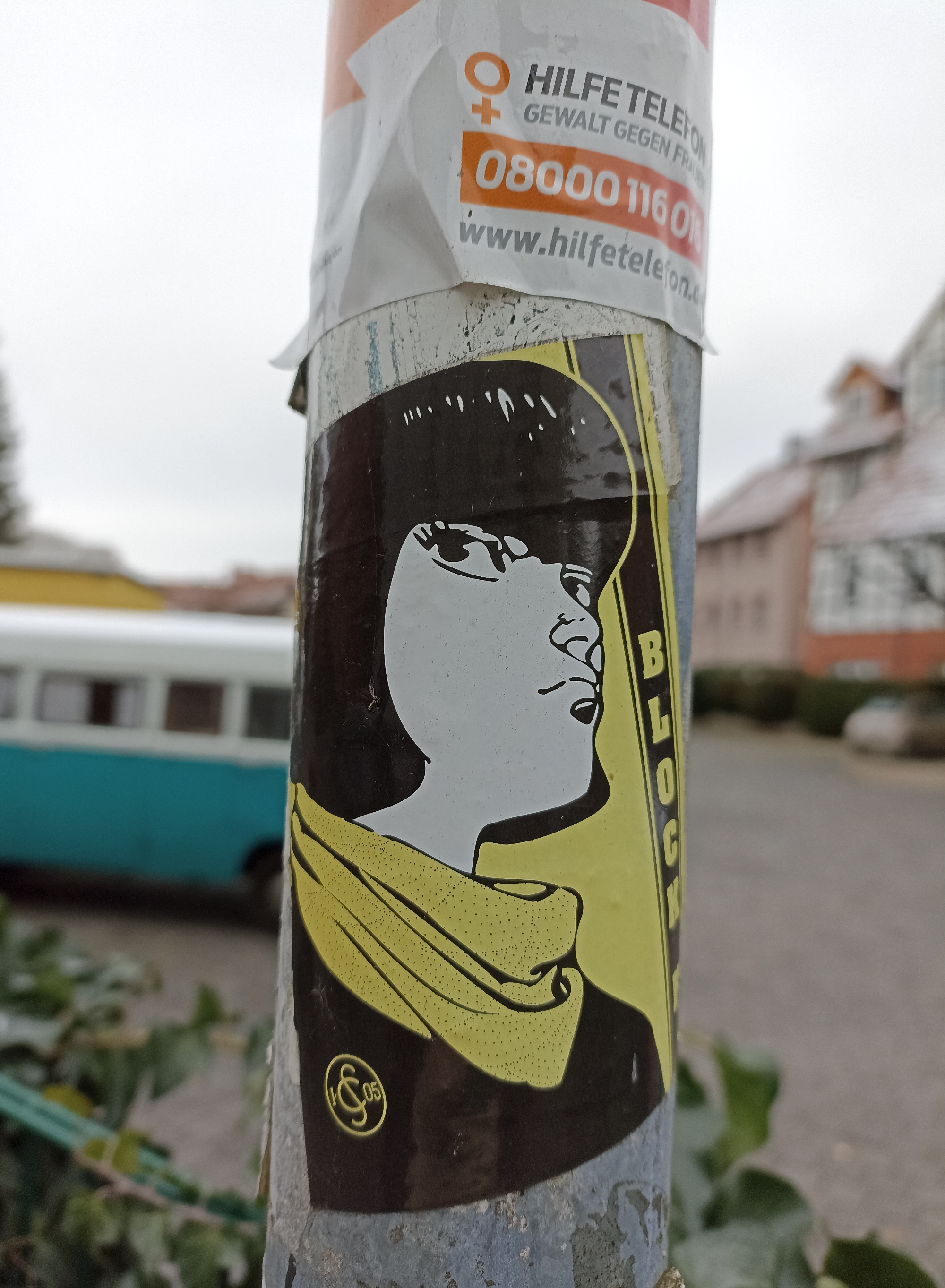
Posted: January 28, 2024 Filed under: street art | Tags: Akira, comics, football, Göttingen, German, manga, reception, sports, stickers, street art Leave a commentOn the streets of Göttingen, Germany, supporters of the local football (soccer) club have pasted stickers with characters from Ōtomo’s manga.

This first one with Kaneda’s face I have known for many years. It says “Antifa Ultras Göttingen 05”. But there are two other motifs which I have spotted only recently:
And another one with Kaneda and “Block F”:
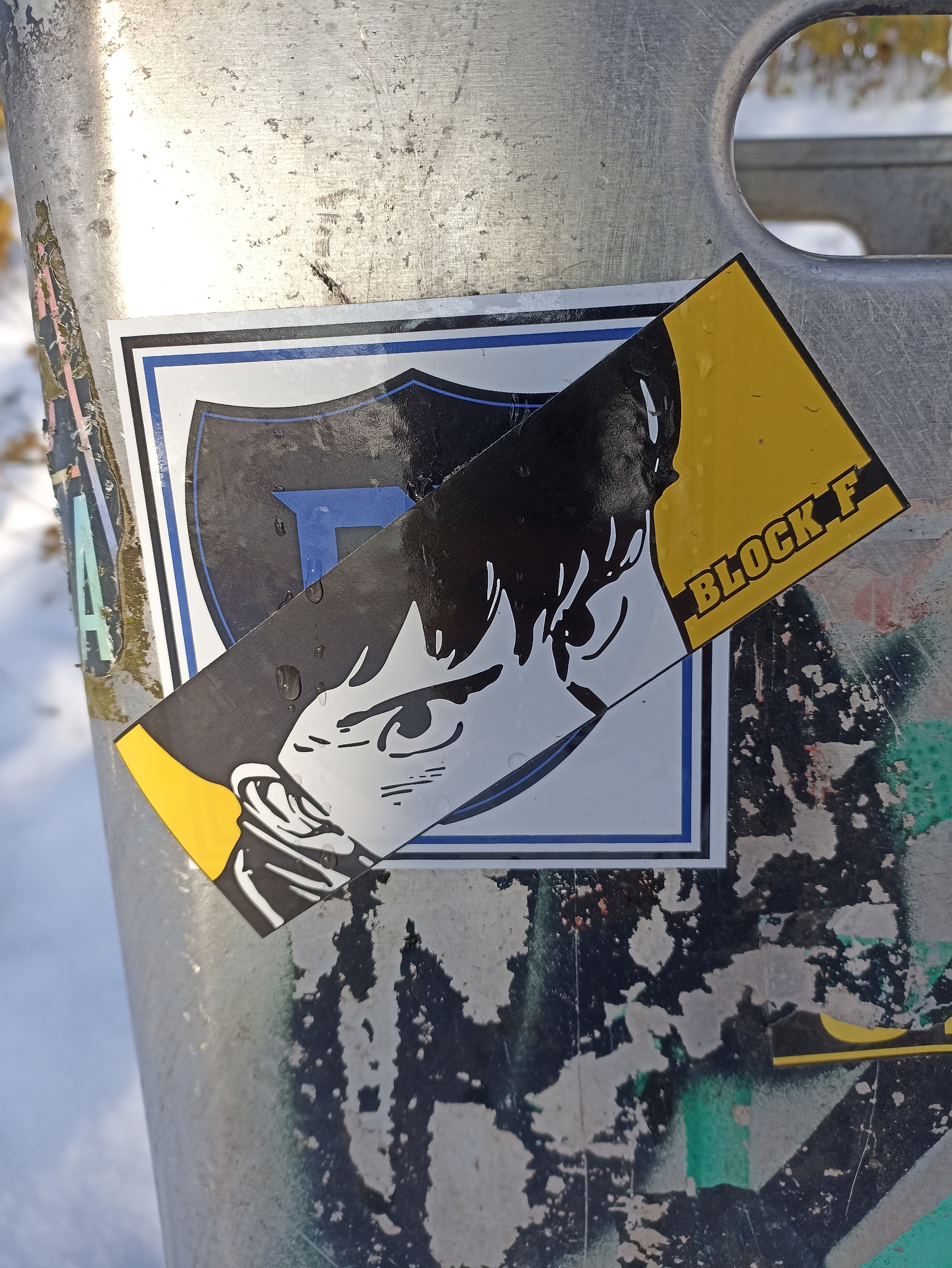
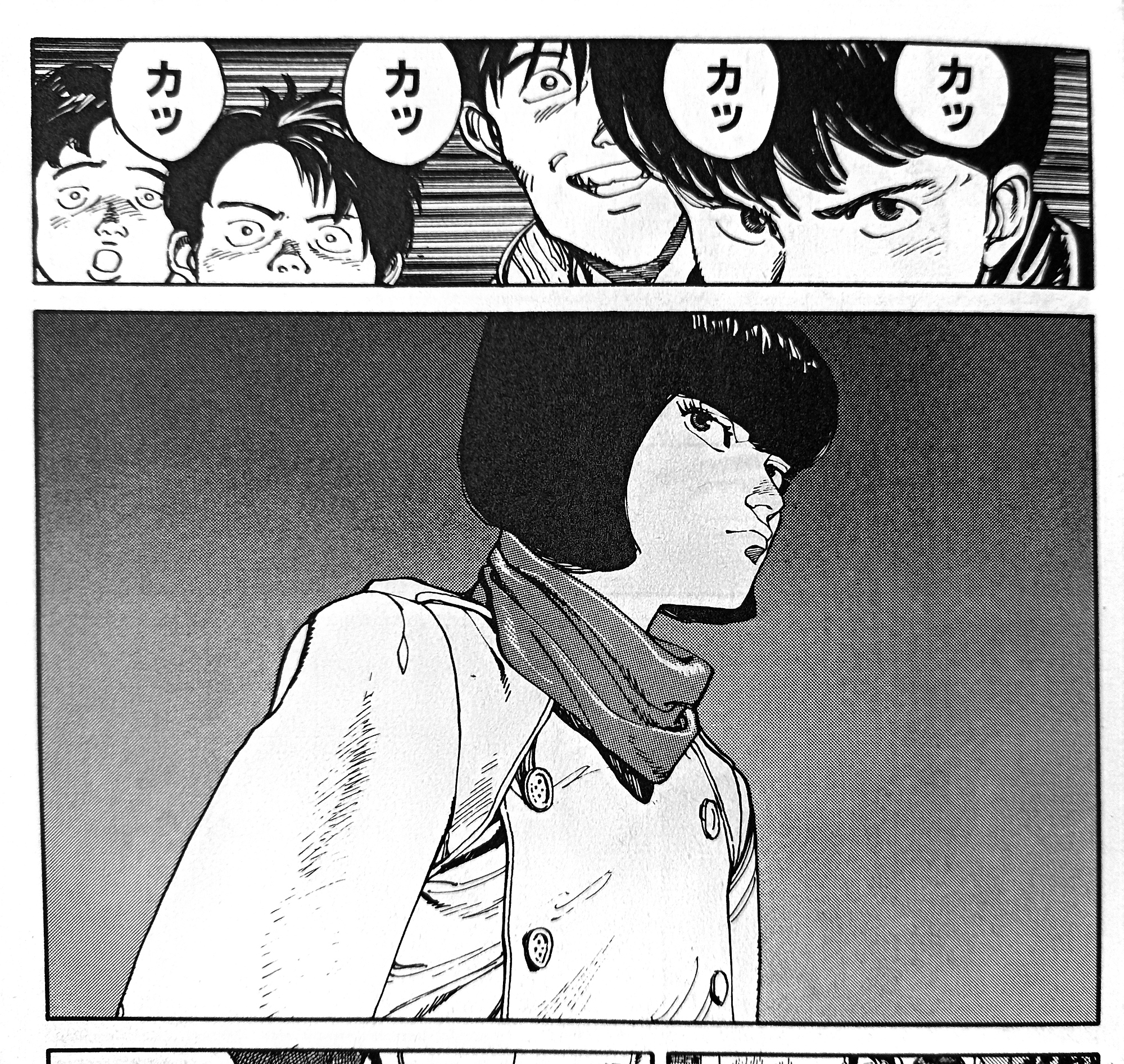
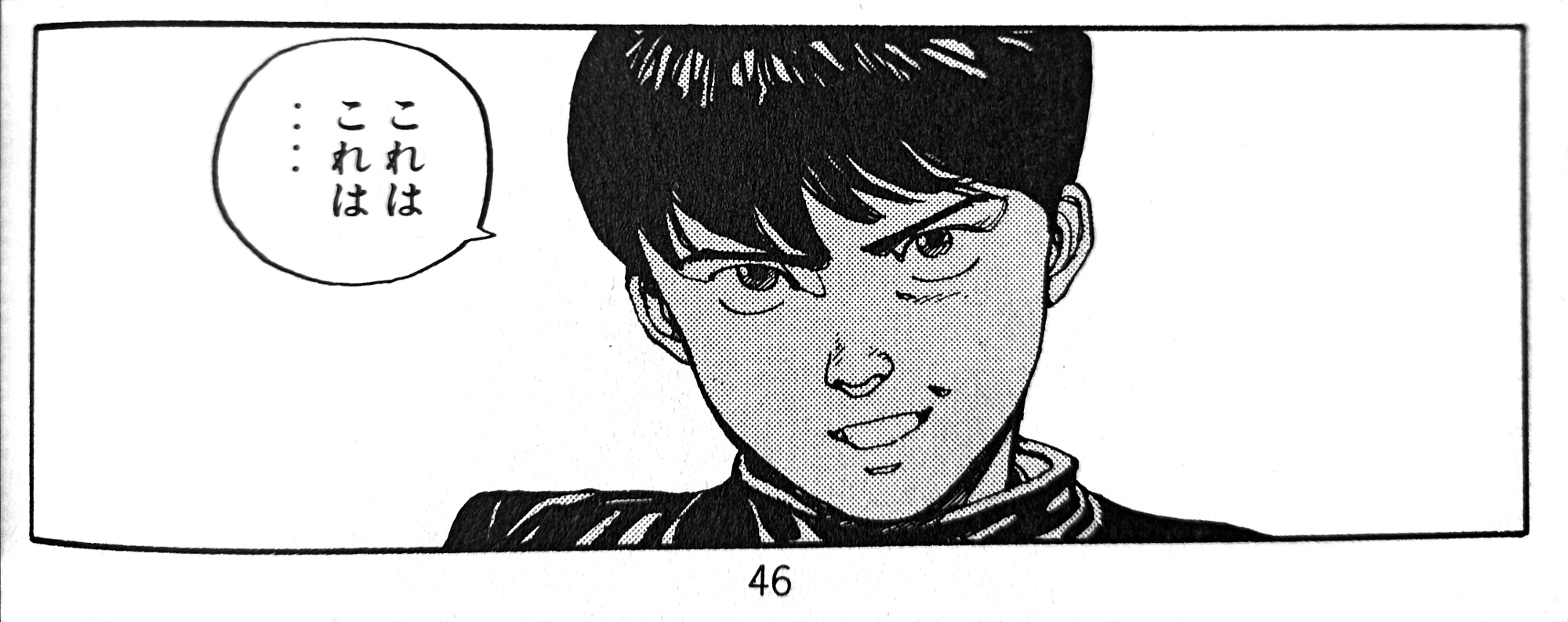
Interestingly, all three motifs are taken from the same scene early in the manga (pages 41 and 46 in the 1st volume of the Japanese collected edition): the third sticker shows Kaneda’s face when he first sees Kei as she is entering the Harukiya bar. Kei’s sticker image is taken from the panel directly after. Kaneda’s face from the first sticker is based on a panel a few pages later, when he accidentally runs into Takashi again while chasing after Kei and Ryu.
The images were transferred from the manga to the stickers almost unaltered, only the more intricate parallel hatching was removed or simplified – and, of course, the sticker images are mirrored, as they were most likely copied from the (flipped) German edition of the manga.
On the one hand, it’s surprising that the football supporters haven’t chosen more iconic images from Akira – e.g. laser gun-wielding Kaneda, pill-popping Tetsuo, or Kaneda with his motorcycle – but on the other hand, the defiant gazes of the three rather nondescript (i.e. not necessarily sci-fi) figures chosen already create a subtle countercultural vibe that might have appealed to the sticker designer(s).
The best comics of 2023: a meta list
Posted: December 25, 2023 Filed under: review | Tags: 2023, best-of lists, comics, ranking, year-end review Leave a comment
If the Internet is to be believed, comics are getting better and better every year. At the same time, I get the impression that comics are getting less and less online coverage. Most notably, Goodreads have dropped the ‘Graphic Novels’ category in their year-end awards. Anyway, there’s still a sufficient number of best-of-the-year lists around to yield a meaningful result when merging them into a master list (by assigning points to each comic based on its rank or the total number of list items; full explanation of this methodology here). Thus here are…
THE TOP 25 COMICS OF 2023:
- Roaming by Jillian and Mariko Tamaki (242 points)
- Monica by Daniel Clowes (190)
- A Guest in the House by Emily Carroll (146)
- The Talk by Darrin Bell (125)
- Shubeik Lubeik by Deena Mohamed (92)
- Wonder Woman Historia: The Amazons by Kelly Sue DeConnick and others (88)
- Chainsaw Man by Tatsuki Fujimoto (81)
- Blood of the Virgin by Sammy Harkham (80)
- Akane-banashi by Yuki Suenaga and Takamasa Moue (78)
- Do a Powerbomb by Daniel Warren Johnson (77)
- Sōsō no Frieren (a.k.a. Frieren: Beyond Journey’s End) by Kanehito Yamada and Tsukasa Abe (74)
- The Super Hero’s Journey by Patrick McDonnell (71)
- Impossible People by Julia Wertz (70)
- The Immortal Thor by Al Ewing and Martín Cóccolo (69)
- Namok (a.k.a. The Naked Tree) by Keum Suk Gendry-Kim (65)
- Batman/Superman: World’s Finest by Mark Waid and Dan Mora (61)
- One Piece by Eiichirō Oda (58)
- Family Style by Thien Pham (57)
- Ducks: Two Years in the Oil Sands by Kate Beaton, tied with
Oshi no ko by Aka Akasaka and Mengo Yokoyari (56) - –
- Blue Lock by Muneyuki Kaneshiro and Yusuke Nomura (55)
- Damn Them All by Simon Spurrier and Charlie Adlard, tied with
Daredevil by Chip Zdarsky and Marco Checchetto / Saladin Ahmed and others (54) - –
- Birds of Prey by Kelly Thompson and Leonardo Romero, tied with
Last on His Feet by Adrian Matejka and Youssef Daoudi (53)
Other notable manga this year are Dandadan by Yukinobu Tatsu (rank 28), The JoJoLands by Hirohiko Araki (rank 34), Hikaru ga shinda natsu / The Summer Hikaru Died by Mokumokuren (rank 36), and Kimi wa hōkago Insomnia / Insomniacs After School by Makoto Ojiro (rank 39). As for (non-Anglophone) European comics, Juliette by Camille Jourdy would probably just about make the top 50, while the noteworthiest German comics (so far) would be Anke Feuchtenberger’s Genossin Kuckuck and Barbara Yelin’s Emmie Arbel which were ranked 2nd and 3rd respectively in the yearly poll of 30 German comics critics.
The following lists were evaluated: AITP (part 1, part 2), Barnes & Noble, Book Riot, CBC, Chicago Public Library, Comickunst (German), Forbes, Gamesradar / Newsarama (comics, manga), German critics’ poll via Börsenblatt, Gosh (adult, kids), The Guardian (James Smart, Rachel Cooke), IGN, Kono manga ga sugoi via Anime News Network, Library Journal, Looper (DC, Marvel), NPR, NYPL, Nerdist, Oricon via The Beat, Polygon, Popverse (staff, readers), Publishers Weekly, School Library Journal (graphic novels, manga), Screen Rant (ongoing manga, new manga), Washington Post, YALSA.
Manga review, Halloween 2023 edition: Soul Eater
Posted: October 31, 2023 Filed under: review | Tags: action, Atsushi Ōkubo, comics, Halloween, manga, shōnen, Soul Eater Leave a commentNot a horror manga by any means, but it oozes the spirit of Halloween like no other.
Soul Eater (ソウルイーター Sōru ītā) “Massiv” vol. 1 (collects prologues 1-3 and ch. 1-9)
Language: German (originally Japanese)
Author: Atsushi Ōkubo
Publisher: Carlsen (originally Square Enix)
Year: 2020 (originally published 2003-2005)
Total number of volumes: 25 (12 in the “Massiv” edition)
Pages: ~560
Price: € 5
Website: https://www.carlsen.de/reihe/soul-eater-massiv (German publisher), https://www.mangaupdates.com/series/st0a9nt/ (Baka-Updates)
ISBN: 978-3-551-02961-4
In Soul Eater, three schoolchildren are paired with supernatural anthropomorphic living weapons to kill “witches” and other “evil” people. Fighting ensues. That’s all you need to know about the bog-standard story of this manga.
Soul Eater has been criticised for how intangible, unrealistic, vague and superficial its setting feels. We learn very little about the day-to-day lives of the protagonists and the other people who inhabit this world (is it a fantasy world? An alternate reality? A parallel dimension? Where and when is the story supposed to take place?), and how they ended up where they are now. This is certainly true for many manga of the ‘fighting shōnen’ variety, but for Soul Eater maybe even more so.
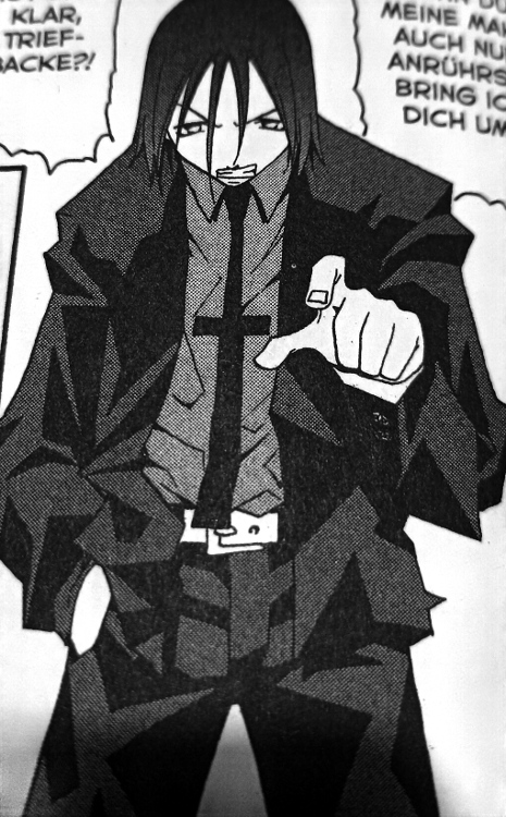
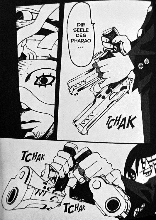
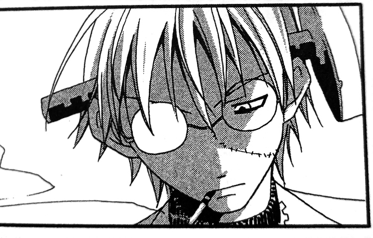
The strength of this manga lies not in a gripping story or an immersive setting, but rather precisely at the surface of things – its designs. Everything, from the characters to the built environment in the background, is designed to look cool, and any realism is sacrificed to that end. There’s a character with a necktie in the shape of a cross. There’s another character who fights with two pistols held upside down, using his pinkies to pull the trigger. And, of course, there’s the wickedly grinning sun and moon which can sometimes be seen in the sky, almost two characters in their own right. If Soul Eater has earned a place in manga history, it’s surely due to these two iconic designs.
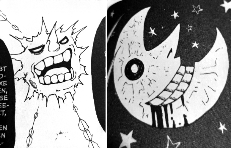
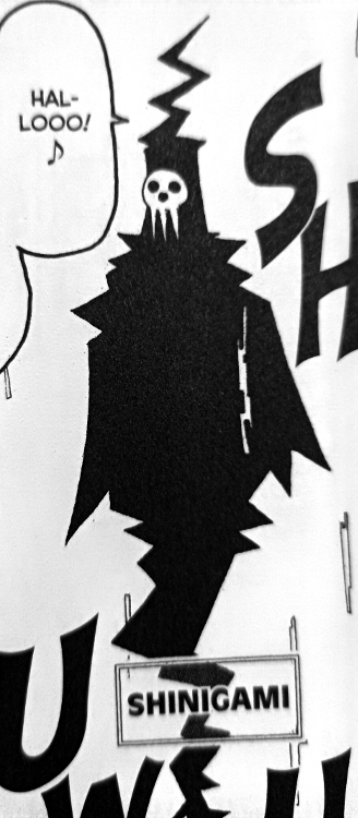
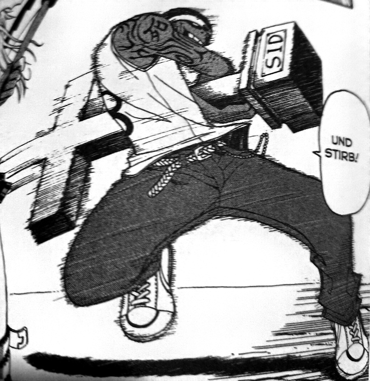
And that’s where the Halloween connection comes in. The style of Soul Eater is not merely cool, it’s often morbid, twisted, grotesque and bizarre. Some more examples: “Dr. Frank Stein” who has a giant screw in his head. Shinigami, the Death God, headmaster of the kids’ school, who is almost always depicted as a zig-zaggy two-dimensional floating spectre with a simplified skull for a face. Sid the Zombie who uses his own gravestone as a weapon. And, last but not least, the name of one of the protagonists, “Black⛤Star” – yes, that’s right, the pentagram is part of his name, and the other characters always address him like that.

Is Soul Eater a manga worth reading? Perhaps not. But it might be a manga worth seeing.
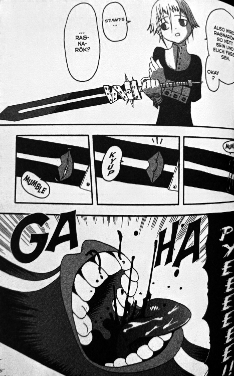
Scariest moment: Nothing really scary here, but some of the antagonists are quite creepy. E.g. Crona and her living sword Ragnarok.
Rating: ● ● ○ ○ ○
Find the previous Halloween blogposts here: 2022, 2021, 2020, 2019, 2018, 2017, 2016, 2015.
2022 exhibitions wrap-up: Akira in Berlin, documenta fifteen, Venice Biennale
Posted: September 11, 2023 Filed under: review | Tags: Akira, anime, Berlin, contemporary art, documenta, exhibition, Kassel, museums, Venice Biennale Leave a commentWhile I did see some exhibitions in the second half of 2022, I was busy with other things (teaching, preparing my book for publication) and didn’t get round to blogging any reviews of those shows. However, in order to acknowledge their significance, and because I don’t want to interrupt my long-standing tradition of showcasing sequential art at documenta and Biennale, I’m going to at least share some brief thoughts and glimpses now.
Akira – The Architecture of Neo Tokyo, Tchoban Foundation, Berlin, Germany, June 4 – September 4, 2022
The Tchoban Foundation – Museum for Architectural Drawing is quite a new venue in Berlin; they opened in 2013 and I hadn’t been there before. The Akira exhibition was curated by Stefan Riekeles who had, in 2020, also published the Anime Architecture book and distributes prints of the artworks. The exhibition consisted mainly of original background art (plus some preparatory artwork) for Akira, Katsuhiro Ōtomo’s 1988 theatrical anime adaptation of his own manga. This kind of material is rarely exhibited, let alone outside of Japan, which made for an interesting and instructive visit.
Unfortunately I didn’t take any pictures at the exhibition, but you can find some at Riekeles Gallery.
documenta fifteen, Kassel, Germany, June 18 – September 25, 2022
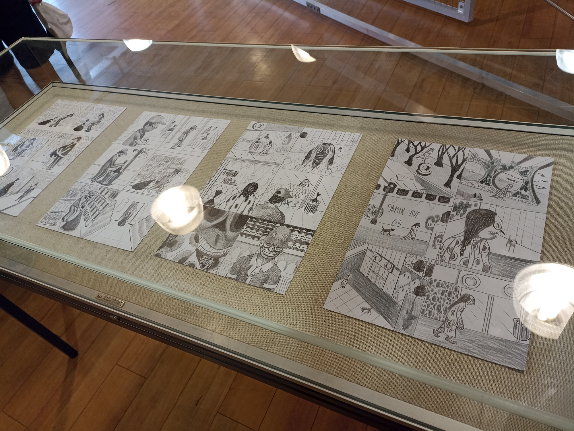
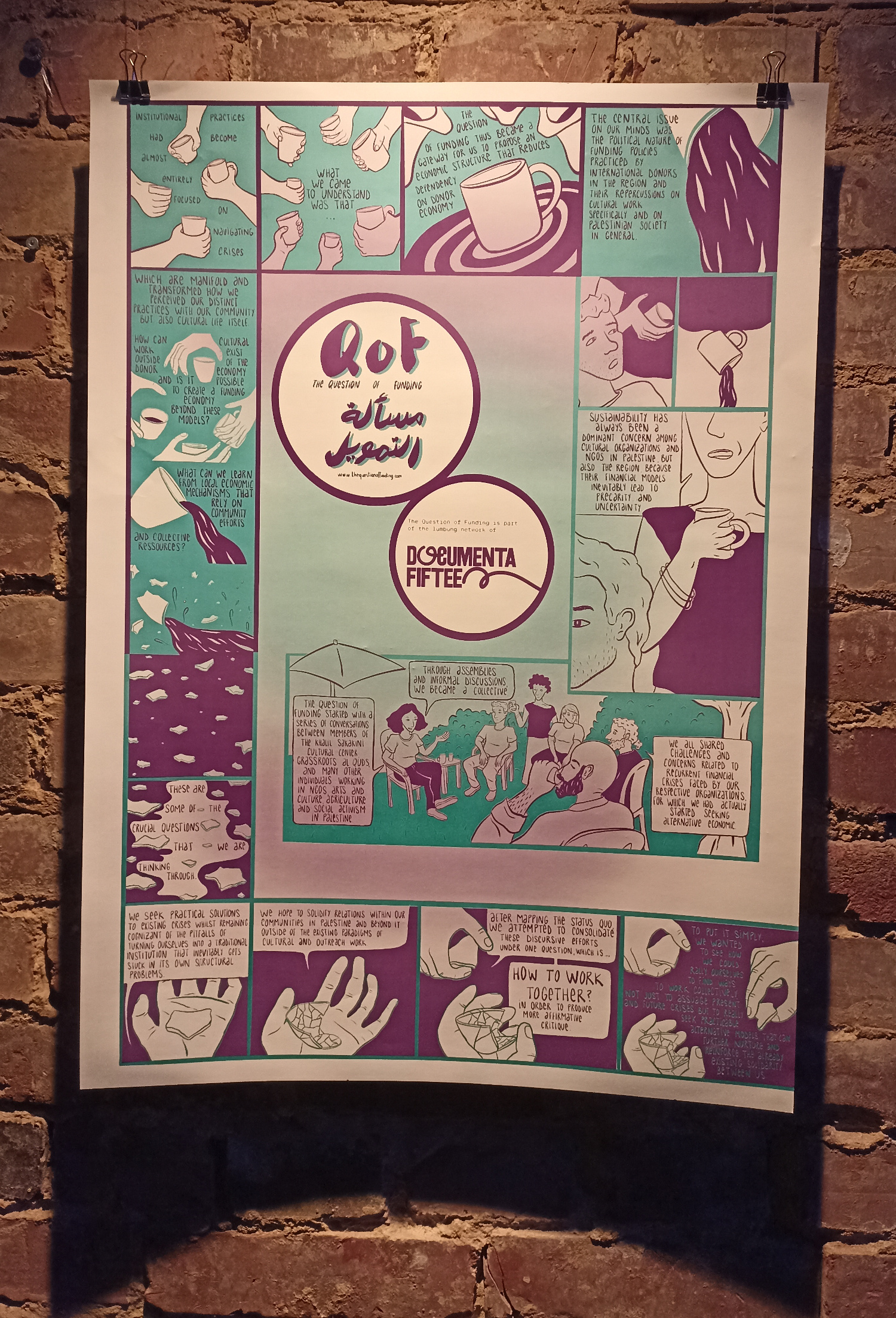
Sadly, documenta fifteen will be remembered first and foremost for the antisemitism scandal, rather than any particular artworks themselves, most of which were once more quite austere, demanding, and overly highbrow – all in all a bit underwhelming. I have spotted only very few that can be said to have anything to do with comics or sequentiality:


59th Venice Biennale, Venice, Italy, April 23 – November 27, 2022
Venice Biennale, in contrast to the documenta, was more of a mixed bag, the artworks ranging from gorgeous to garish, as always. These comics- or sequentiality-related works caught my eye:


Vertical Akira
Posted: August 28, 2023 Filed under: review | Tags: Akira, animation, anime, Artificial Intelligence, film, intermediality, media, reception, remakes, video Leave a commentLately it seems like every day people come up with ingenious new ways to use the latest generation of AI algorithms. A few weeks ago, this video by Eric Groza (and the accompanying text) sparked some controversy:
The result looks impressive and aesthetically pleasing, but the choice of Akira as example is a bit odd, as it does not represent a realistic use case – as many commentators have already pointed out, who would want to see a two-hour long film on a phone (and not simply turn the phone sideways while doing so)? Perhaps it would have made more sense to take a work that (for whatever reason) has been filmed vertically and expand it to a horizontal 16:9 aspect ratio. E.g. Pushed and Touched By A Gorilla In Uganda. Who wouldn’t love to see that in widescreen? Then again, the creator of that cinematic masterpiece had intended it to be seen vertically, so why mess with his or her artistic vision.
Anyway, back to Akira: interestingly, someone else seems to have had the same idea as Groza, and his or her video apparently precedes Groza’s by ten days.
https://www.tiktok.com/@artstuffandthings/video/7256903930267864362
Artstuffandthings’s TikTok channel contains many more vertically expanded animated (and even some live-action) film clips, the first entry dating from July 15. However, they look less seamless than Groza’s, and contain more of the glitches typical of AI-generated images. It’s interesting to see the differences in the results that both creators have come up with based on the same film. There are even some scenes that feature in both videos, e.g. this one:
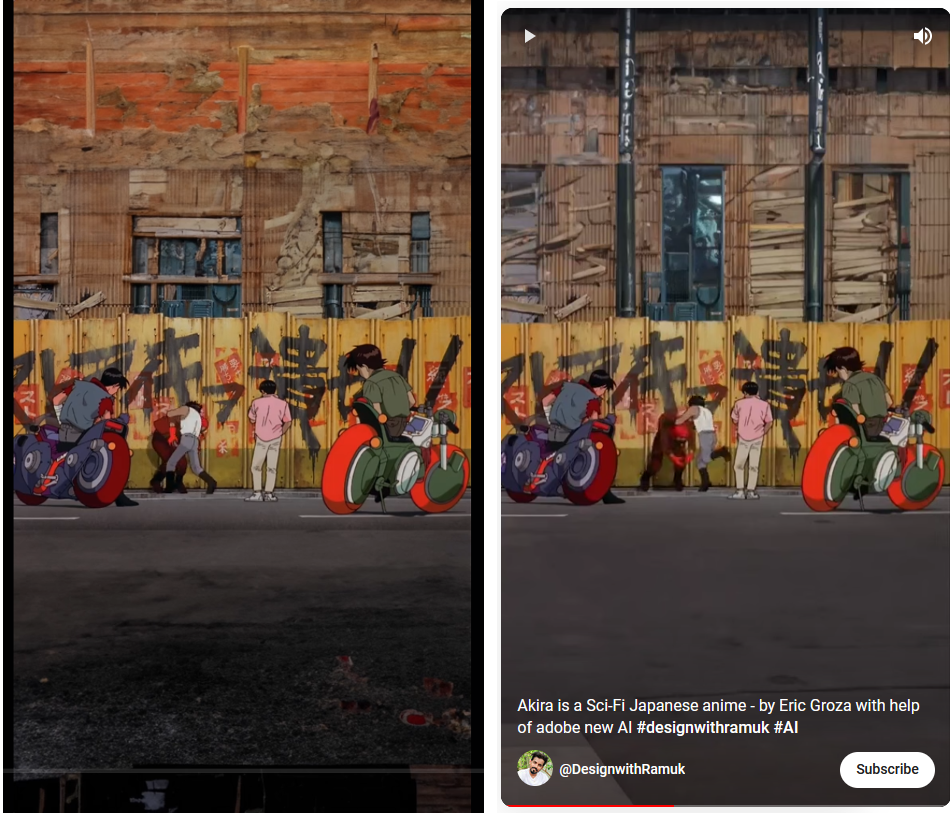
The upper thirds in both videos look quite different from one another but each in its own way is convincing, while the lower third in artstuffandthings’s clip on the left has a photorealistic look to it that doesn’t fit well with the rest of the image.
In the end, the two ‘vertical Akira‘ videos confirm what we already knew about AI-generated imagery: the outcome depends not only on the software, but also on the person operating it. And they show that a 35-year-old anime still captures the imagination of creators today.
Book ‘The Early Reception of Manga in the West’ published
Posted: July 2, 2023 Filed under: shop talk | Tags: art history, comics, German, manga, PhD, publication, reception, US 2 Comments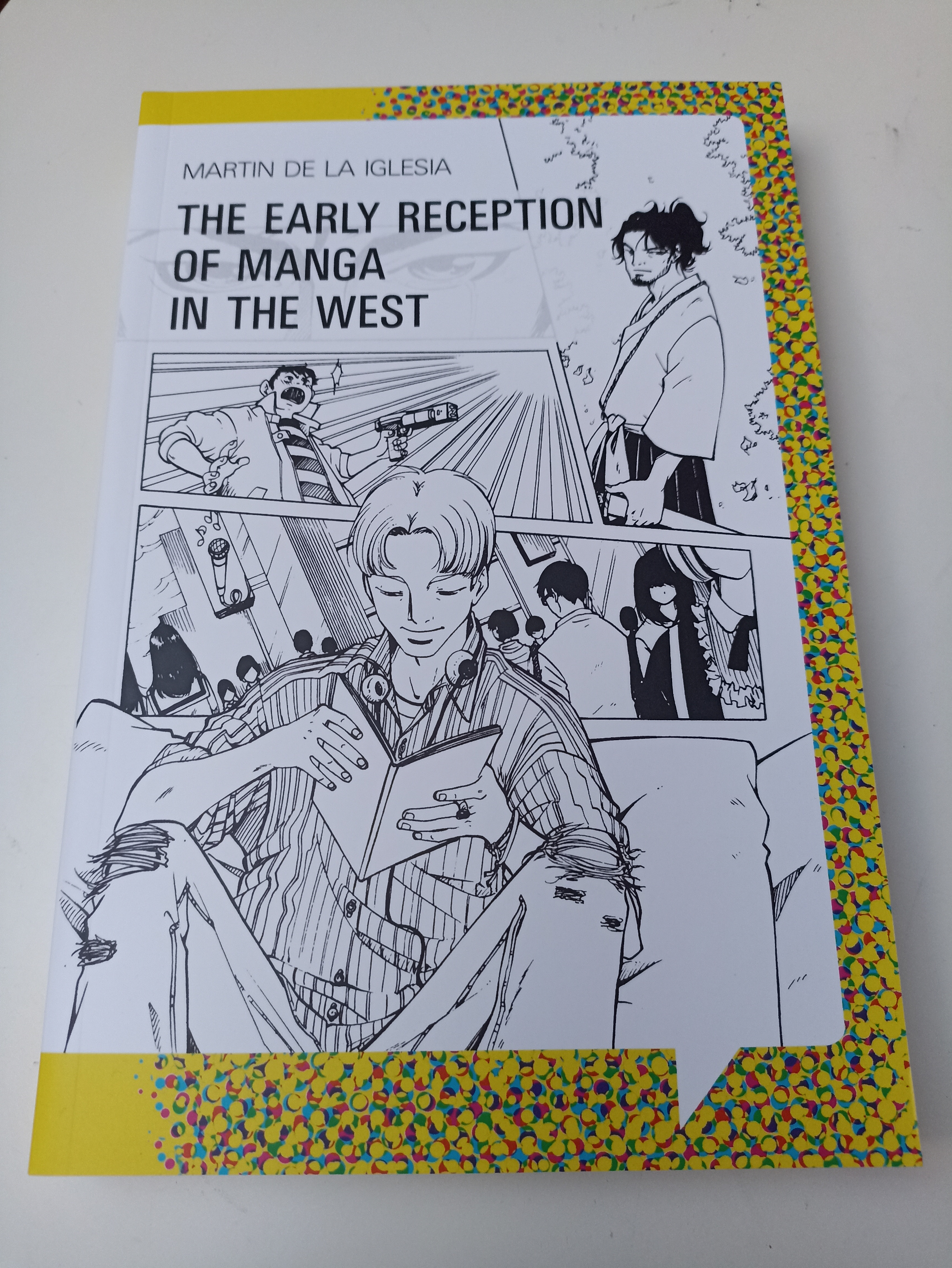
I’m thrilled and excited that my PhD thesis has now been published in print:
The Early Reception of Manga in the West
Ch. A. Bachmann Verlag 2023
ISBN 978-3-96234-077-3
http://www.christian-bachmann.de/b_bn13.html
It has turned out a beautiful yet affordable book, with a cover illustration by none other than Christina Plaka! Here’s the blurb:
Nowadays, manga are ubiquitous not only in their home country Japan but also in the Western world. In some Western countries, they have even surpassed American and European comics in popularity. When did this manga boom start? Many people would think of the late 1990s, when dubbed anime adaptations of manga such as Dragon Ball or Sailor Moon ran on television.
This book, however, explores an earlier wave of manga around the year 1990. It examines what the first translated editions of Kazuo Koike and Gôseki Kojima’s Lone Wolf and Cub and Shôtarô Ishinomori’s Japan Inc. looked like, and how readers in the United States and in Germany reacted towards these manga.
Their impact was still rather limited, but then, this first manga wave culminated in 1988/1991 when Katsuhiro Ôtomo’s manga masterpiece, Akira, was published in English and German, among other languages. Its reception in the West is analysed in great depth in this book, including chapters on the perception of Akira as cyberpunk and its anime adaptation.
Akira opened the floodgates, and in its wake, many more manga titles found their way to American and European readers, including even lengthy but otherwise mediocre series such as Kazuo Koike and Ryôichi Ikegami’s Crying Freeman, the last of the four manga examined in this book. Although manga sales would later soar to greater heights in the 2000s with One Piece, Naruto and others, the first manga wave of ca. 1987–1995 deserves to be remembered for having paved the way.
Copies can be ordered (and review copies requested) from the publisher at http://www.christian-bachmann.de/bestell.html.
Exhibition review: Will Eisner, Basel, 11.3.–18.6.2023
Posted: June 12, 2023 Filed under: review | Tags: Basel, Cartoonmuseum, comics, exhibition, museums, US, Will Eisner Leave a commentCurated by Alexander Braun (who already brought us exhibitions such as Going West in 2014–2016, Pioneers of the Comic Strip in 2016, and many others), Will Eisner – Graphic Novel Godfather has already been to Dortmund (2021) and Erlangen (2022) and will move on to Rendsburg later this year. At Cartoonmuseum Basel, it is shown concurrently with another, smaller exhibition (of the Swiss artist group Hécatombe Collectives).
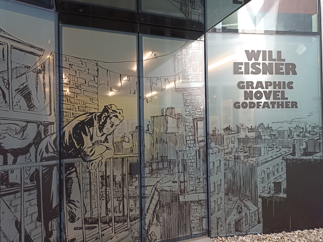
The show opens, of course, with The Spirit. Many original pages are on display, including some entire 7-page episodes from the early 50s. The material displayed lets us see how Eisner sometimes used opaque white over his ink drawings, and in one instance even pasted screentone (albeit with the caveat that Eisner went over some of his drawings again when they were re-published in the 70s, so one cannot be sure when he did what on the page. In itself, the Spirit rediscovery in the wake of the underground comix movement, championed by publisher Denis Kitchen, is a fascinating story that is also made visible here).
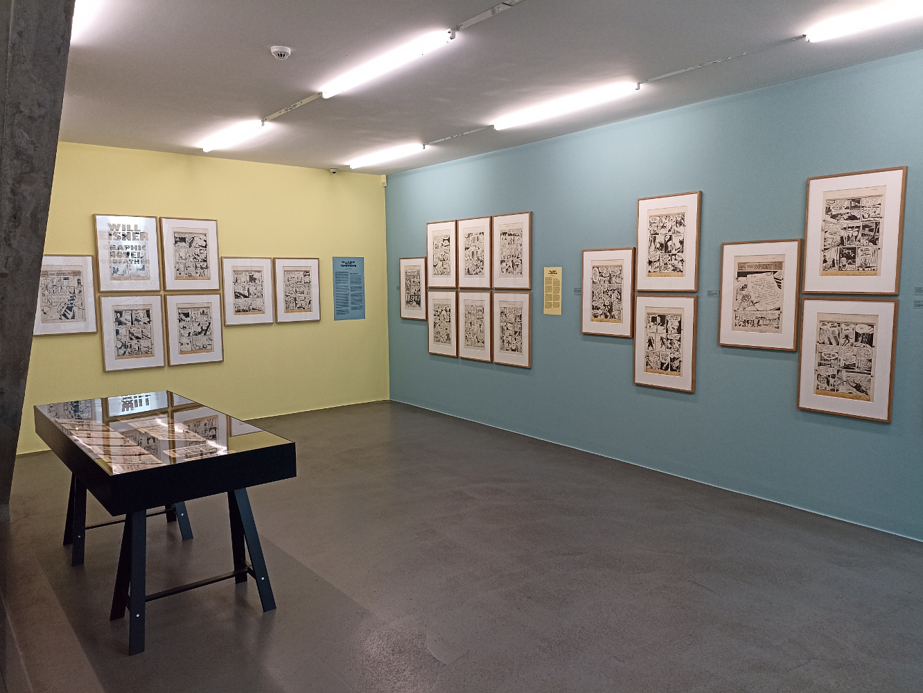
With The Spirit, the young Eisner (1917–2005) seemed to have already perfected the art of comic storytelling and invented every technique a comic artist can invent. But, of course, he didn’t stop there and went on to coin those two influential terms, “graphic novel” and “sequential art”. Pages from his first “graphic novel”, A Contract with God (1978), are on display, as well as later ones which nowadays are all but forgotten, such as A Life Force (1983–1986), To the Heart of the Storm (1991) and Invisible People (1993), among others. Eisner’s teaching at the New York School of Visual Arts from 1974 until 1993 led to the publication of his textbooks Comics & Sequential Art (1985) and Graphic Storytelling (1995). Before his ‘graphic novel phase’ and after The Spirit (as well as during WWII), Eisner produced instruction brochures and posters for the US military – and various other non-fiction graphic material for other clients, e.g. a Complete World Bartender Guide, a copy of which is also shown in this fine exhibition.
Rating: ● ● ● ● ○
